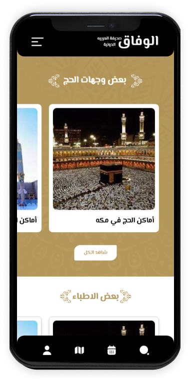
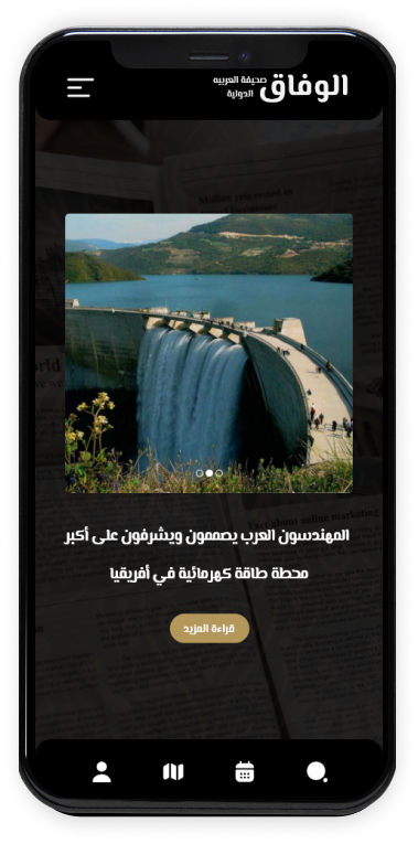
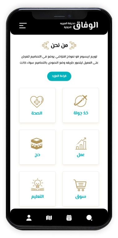
Alvefaq needed to convert customers that came through marketing channels to the site. The challenge with previous site was that sections were not put in right order and customers were not able to reach their goal which was buying tour packages. The big challenge with most tourism sites is that the customers should not be confused interacting with the site and easily find their way through it.

Alvefagh is an Arabian tour operator and travel agency offering tour packages to those interested in Iran. We provide our travelers with any services needed to travel in Middle East, be that tours across the country, help with Iran visa or transport arrangements.
The Challenge
THE SOLUTION
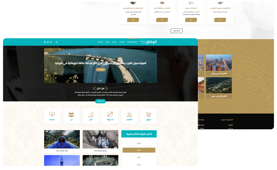
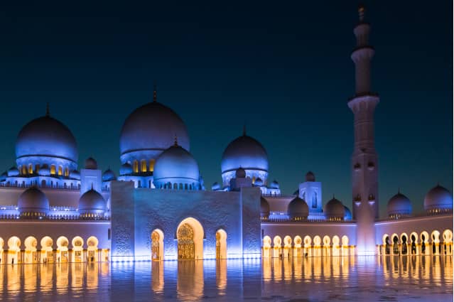
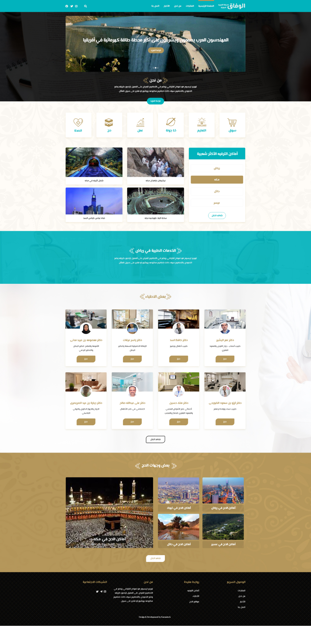
We put a picturesque image of tourist sites that Alvefaq customers mostly choose and wrote a short description of the business essence in first section of the page. It was all to solve the customer challenge to easily get to the main services and eventually buy the tour package.
In addition, we showed the main services Alvefaq provides in the next section. However, we put extra description of services in internal pages for customers who came though marketing channels and have no initial understanding of Alvefaq.
35% of Alvefaq customers are going for medical tourism. The new Alvefaq project for these customers was to list doctors and medical centers, and provide appointment reservation options. We presented an introduction of doctors and medical centers in fourth section to bold the importance of it and used second slide of first section to provide extra information to customers to understand the whereabouts of appointment reservation section.
We also used the best navigation menu based on visitors of the site to quickly reach their goals.
After launching the site, we assessed the site with google analytics for three months and noticed excellent results. Though Alvefaq did not change its marketing team and lead generating channels, the sales amount increased to 40 percent.
Alvefaq site was given to its digital marketing team after three months to better optimize their goals and we had the responsibility to better the user experience and design.
MATERIAL DESIGN
Color pallet
MAIN COLORSTypography
TYPEFACES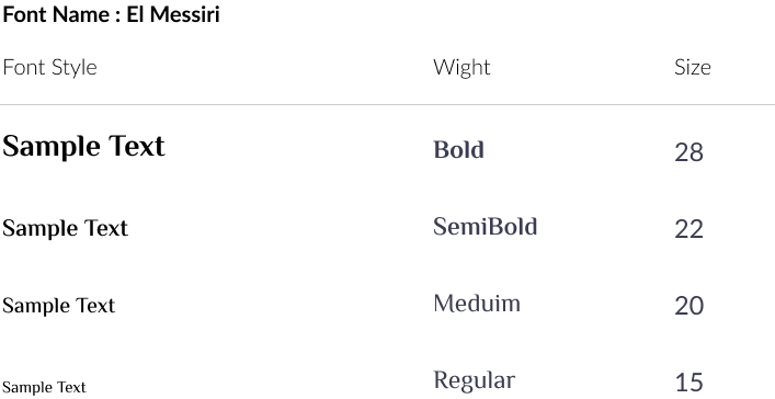
Desktop Landing
Mobile Landing
